
Funding For All
A look at how we created a white-label widget to more equitably distribute government funding.
How can we Disrupt Government Funding?
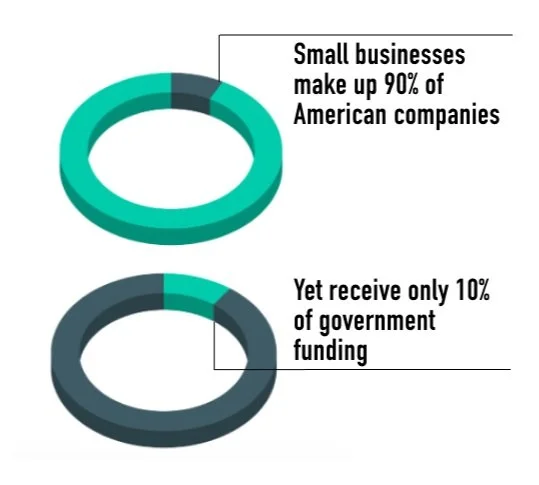
Is it possible to redistribute government funding to more appropriately reflect the actual makeup of US companies and ensure small and local businesses have access to this funding? Many small and medium businesses (“SMBs”) don’t even know this funding exists, so how can we draw attention to the available incentives?
Project Scope
SMBs need a free and efficient way to find government incentives to more evenly distribute government funding.
Creating a free single access point to all available government incentives we provide easier access to funding for small and medium businesses. Designing a widget with a slide-in animation also draws the user’s attention to the tool creating awareness and ultimately allowing more SMB’s the opportunity to apply for government funding. More awareness and more applicants will ultimately help shift the disproportionate allocation of government funding.

two customers,
two solutions.
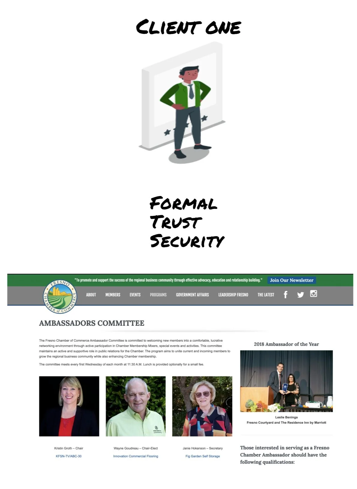
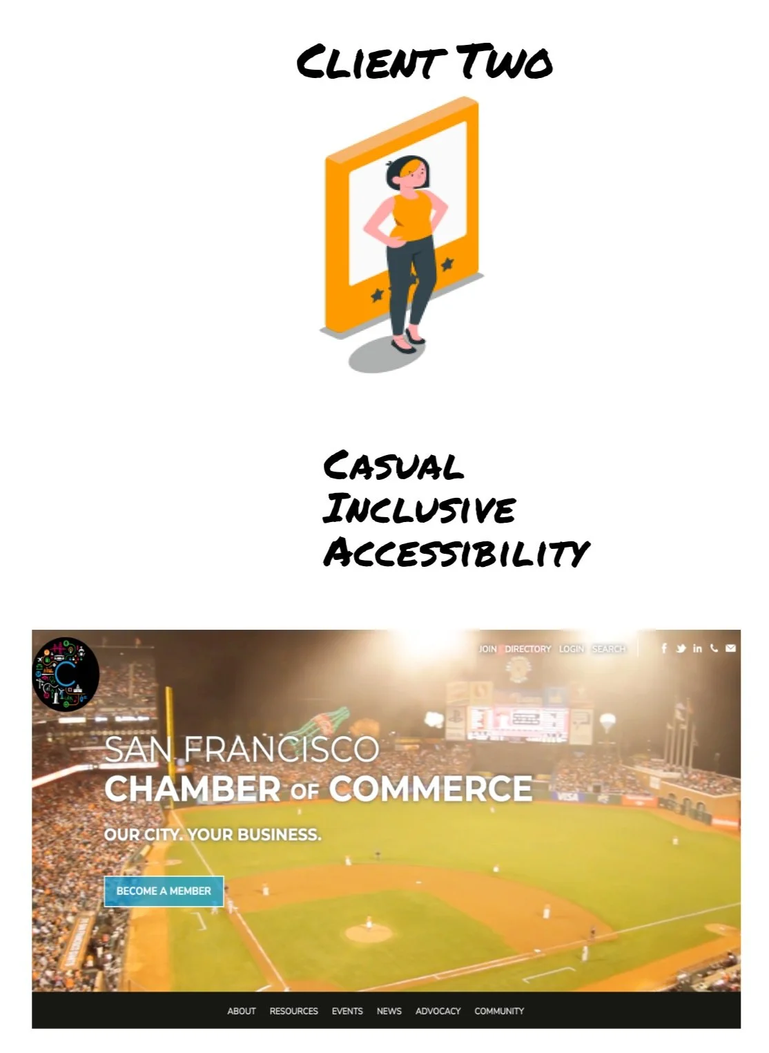
We thoroughly embraced the design practice of diverging and converging. Initially, we had two customer personas that seemed impossibly different. First, the more traditional and formal government body that is concerned with security and professionalism. Second, the more casual and modern small business association or local government looking for a more conversational and inclusive experience.
After hours of scouring the internet researching countless government websites, private lenders, banks, investors, and websites with widgets, we distilled the highlights, called out the flaws, and felt prepared to get some real-life experience from user interviews.
Focus on Users
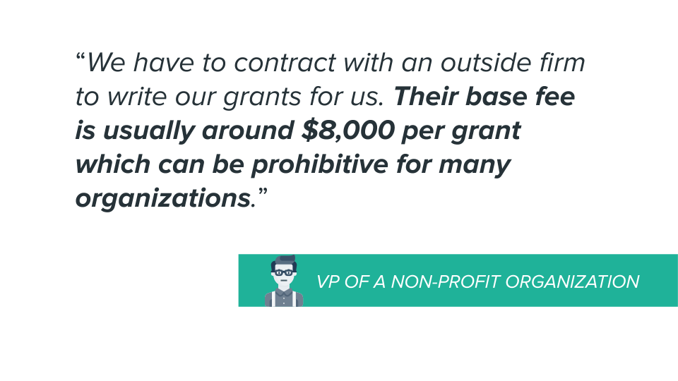
We conducted interviews with five small business owners and a Vice President of a non-profit to gain insights on what their experience had been with government funding if any.
3 out of 5 BUSINESSES
are unaware of economic incentives
afraid of receiving government funding
2 out of 5 BUSINESSES
are unsure about eligibility
are not prepared to apply
have difficulty navigating information
What
We
Learned
Show, don’t tell.
Iterate. Iterate. Iterate!
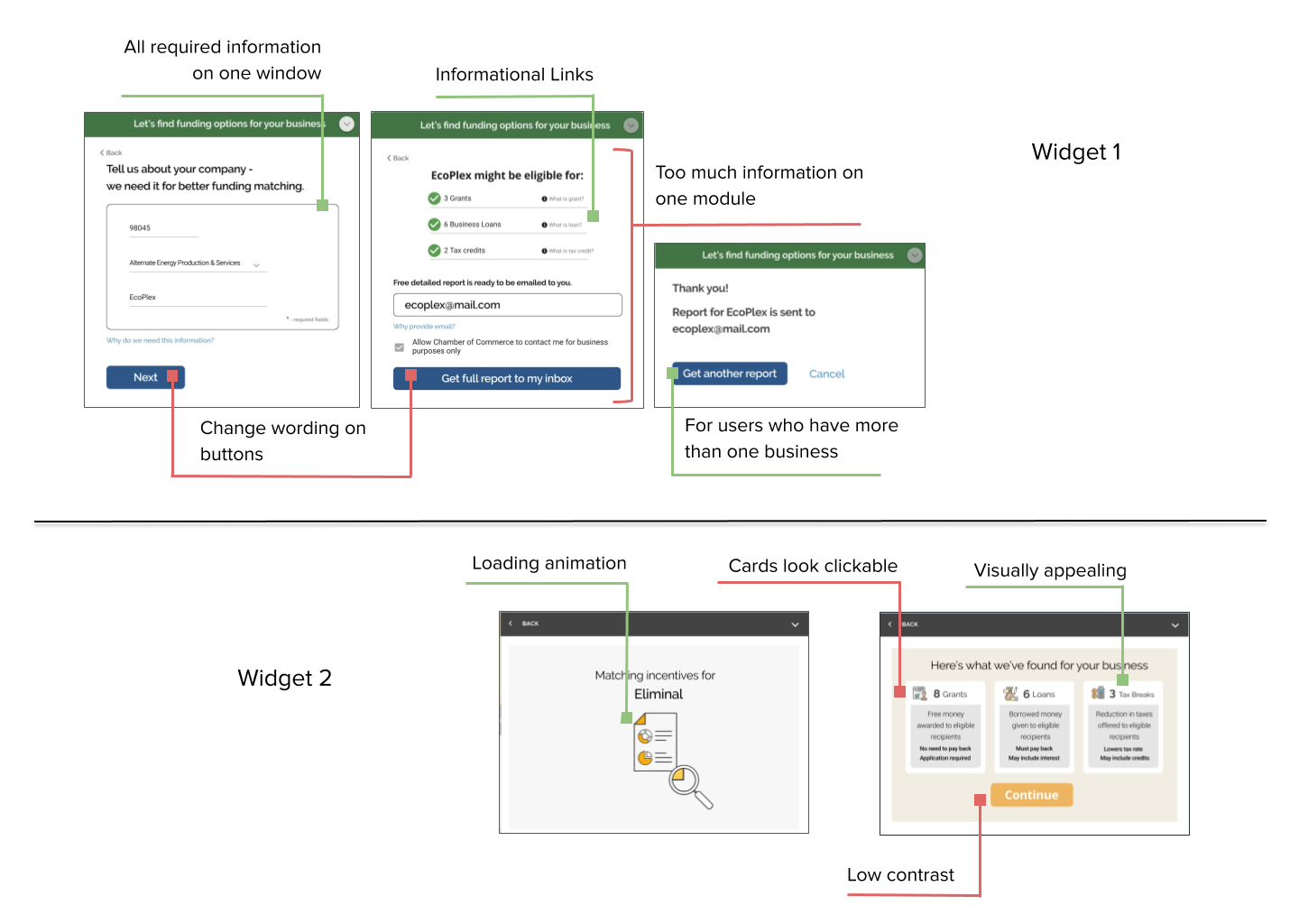
With our two unique customers defined and armed with our user insights, we set about creating our widget. Since we had in mind two very different types of customers, we decided to diverge and explore two different paths.
For our more formal customer, we created a clean and simple design, with only essential functionality. Our second version included more colors, animations, and conversational copy.
We felt it was beneficial to pump out quick and dirty wireframes rather than trying to talk through hypotheticals. Having these early rough drafts allowed us to explore many different options and test many different features.
Testing
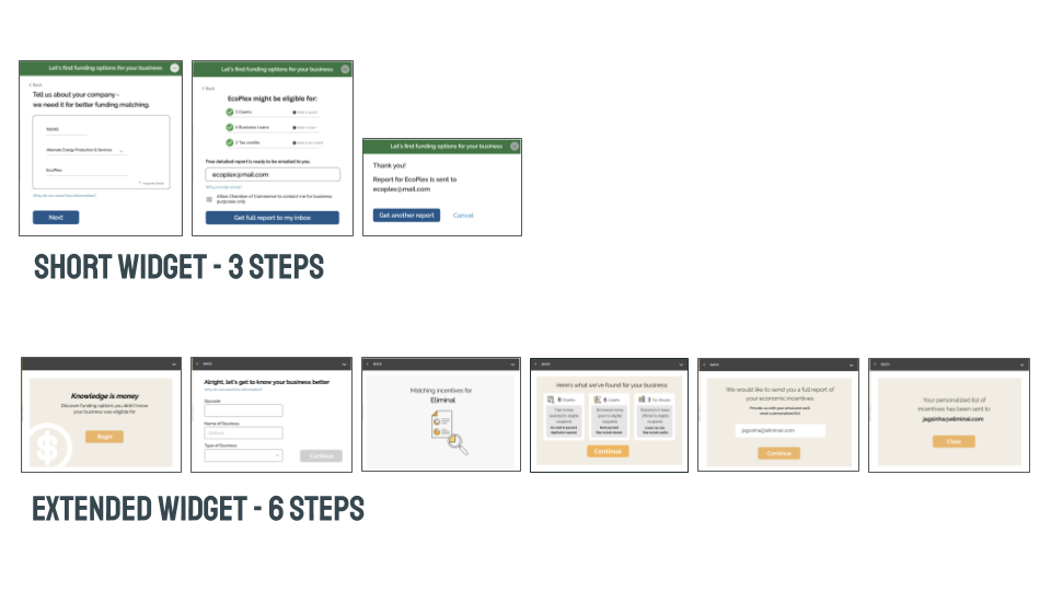
As is often the case, usability testing proved invaluable and altered the course of our work. Our initial hypothesis of needing two separate widgets was disproved and we adapted our widget based on the user feedback.
Problems Pop-up
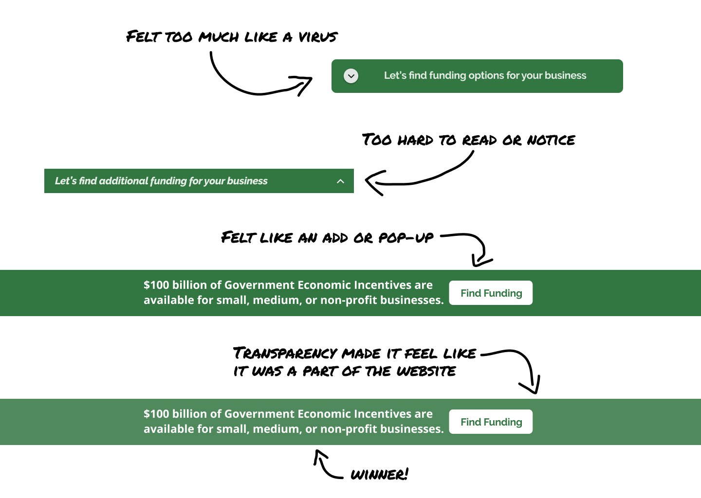
During usability testing, we discovered that the placement of our widget was causing concern. Most users did not initially notice the static bar of the closed widget glued to the bottom right corner of each page. Once users found the widget they expressed hesitation at clicking on the bar as it appeared to be either a pop-up or a potential virus.
With this information, I dove back into our research, looked for more successful examples of widgets and modals on other websites, and then quickly prototyped two alternative options to test. I performed rapid-fire usability testing on four different options and there was a clear preference for the newly created full-width bar with slide-up animation I had just created.
Users found the full-width bar more trustworthy as it felt like it was more a part of the website, something that was intentionally placed there rather than a virus. Quick wireframing and scrappy usability testing got us to an end product that feels seamless, integrated, and trustworthy.
2 become 1
We learned that users loved the short flow of the first widget and were thrilled with the imagery included in the second. We decided to merge the best parts of each widget into one super widget.
Final Product
Click the video below to see our widget in action!
Designing a widget was an interesting challenge where the major focus became building trust with our users. The biggest obstacle we had to overcome was the tendency for widgets to appear as pop-ups or viruses. We worked hard to test and research various placements for our widget in order to build confidence and trust with our users. With our final solution, we hope to help expand public knowledge of government funding for SMBs.