
Orders made easy
Designing a faster, clearer self-serve ordering experience for Café
Role: Senior Content Designer
Domain: Retail, Food Ordering, Omnichannel Commerce, In Store Experience
Surfaces: In-store kiosk, Mobile app
Focus: Translating a content system across two surfaces with different physics, different member contexts, and different definitions of "fast."
TL;DR
I designed Café ordering for two very different environments. On Scan & Go, members are shopping, multitasking, and ordering from wherever they happen to be in the club. On kiosk, they’ve stopped with a clear goal: order food and move on. My role was to take what worked in mobile and adapt it for a completely different physical experience.
The challenge
Same Café. Very different conversation.
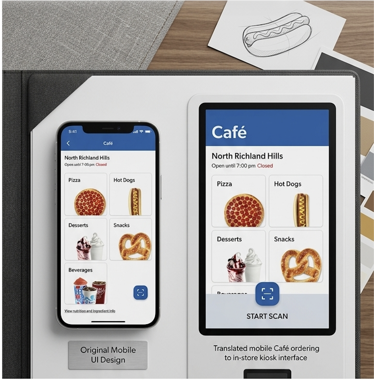
I originally built the Café ordering experience for Scan & Go, including the menu structure, modifier system, customization flow, and transactional messaging.
When the kiosk project started, the question wasn’t “How do we recreate this?” It was “What actually still works in this environment?”
The member mindset is completely different.
On mobile, people are browsing while they shop. They can pause, get distracted, come back later, or split their attention between five things.
At a kiosk, none of that is true.
They walked over with intent. They’re standing. They’re hungry. There’s probably someone waiting behind them. The tolerance for friction drops fast.
The challenge was figuring out:
what could stay consistent across both surfaces
where mobile assumptions broke down
how to make the experience feel faster without losing clarity
My role
Lead content designer on both surfaces
I led content design for Café ordering on both Scan & Go and kiosk.
For Scan & Go, I helped create the experience from the ground up:
information architecture
modifier language
customization flows
transactional messaging
confirmations and error states
For kiosk, I led the adaptation work.
That meant auditing the existing system, identifying where the mobile patterns no longer made sense, and rewriting the experience for a touchscreen environment inside a busy club.
The Approach
Start with what the two surfaces don't share
Before rewriting anything, I mapped the biggest differences between mobile and kiosk behavior.
The menu logic stayed mostly the same. The environment did not.
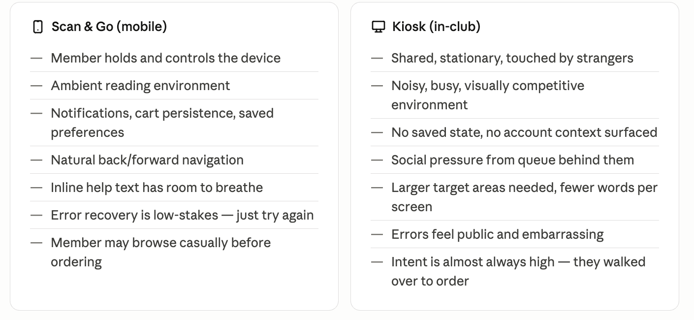
The biggest shift was intent.
On Scan & Go, Café ordering is often spontaneous. Members are still shopping and discovery matters more.
On kiosk, the member already decided to order before they touched the screen.
That let us simplify the experience significantly. Less browsing language. Less explanation. Faster decisions.
Principles
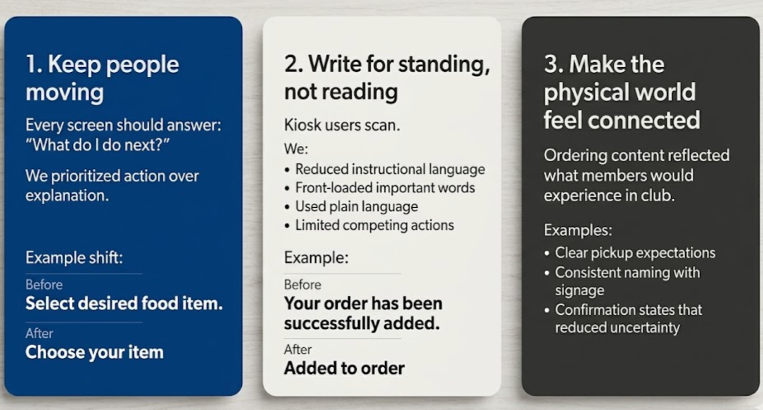
Before rewriting content, I created a set of working principles to guide decisions across both surfaces.
These became especially important anytime kiosk and mobile needed to diverge. Instead of debating preference, we could point back to the environment and the behavior we were designing for.
Key content decisions
-
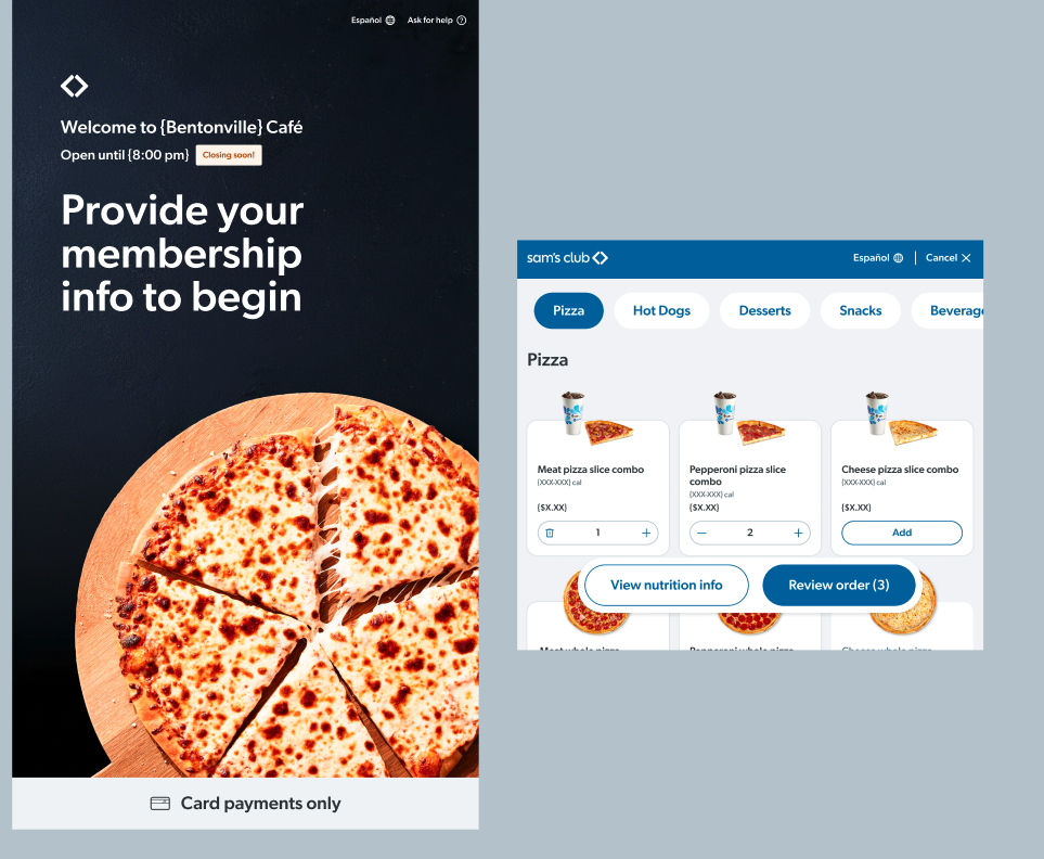
On Scan & Go, the member is already signed in and payment ready.
On kiosk, we start from zero.
The welcome experience had to:
identify the member
explain payment expectations
get them into ordering quickly
I also introduced an early exit path:
Don’t have your membership info? Order with Scan & Go or at the Café counter.
That line exists to prevent a dead end before frustration starts.
-
Scan & Go used category tiles and bottom sheets.
Kiosk used pinned tabs and a larger card grid.
That changed the content requirements immediately.
Descriptions became less important. Item names had to scan faster. Status messaging like “Sold out” needed to work inline and at a distance.
The content system stayed consistent. The presentation changed.
-
The payment screen changes based on:
Sam’s Cash availability
saved payment methods
membership state
Different layouts needed different content hierarchy, but the experience still had to feel cohesive.
The goal wasn’t just clarity. It was making sure members always understood what was happening without feeling like they landed in the wrong flow.
-
Mobile had more room for warmth and reassurance.
Kiosk needed speed.
I stripped the confirmation experience down to only the information that mattered most:
It’ll be ready at the Café pickup area. Be sure to grab your receipt.
Short. Directional. Easy to scan while walking away.
I also added a rating prompt before dismissal since kiosk creates a natural pause point immediately after purchase.
-
Before:
Transaction unsuccessful.
After:
Something went wrong. Try again or ask an associate for help.
The goal was simple:
explain the problem
give a next step
avoid dead ends
Recovery actions were always prioritized visually and verbally.
Outcome
The kiosk experience is currently being tested in select clubs.
The original Scan & Go content system scaled into kiosk without requiring a full rebuild. Members still encounter the same voice, modifier logic, and ordering patterns across both surfaces.
The work also established reusable kiosk standards for:
label hierarchy
character limits
transactional messaging
error handling
The biggest takeaway was proving that a strong content system can adapt across very different environments without losing consistency.
What I learned
One of the advantages of building the original system is knowing exactly why things work.
One of the risks is assuming they’ll work everywhere else too.
The biggest mindset shift was treating kiosk like its own product instead of a resized version of mobile. That’s where the best content decisions came from.