
Engagement Through Play
Creating a digital experience for Bouquets to Art at the de Young Museum
THe Question: How can we Engage viewers to return?
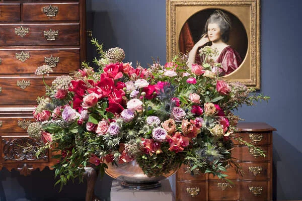
Bouquets to Art has been one of the de Youngs most well-attended exhibits year after year. In this design sprint, we look at how we might convert this initial spark of interest fueled by the exhibit into a deeper and repeatable viewer engagement through the use of a digital platform.
Project Scope

Engaged viewers are return customers
We believe that by providing an informative, interactive, and accessible mobile experience for museum visitors we are more likely to captivate and inspire single visit customers to return.
Our team specifically focused on targeting casual museum-goers, those that go to different museums for social reasons a few times a year. We believe these visitors would be more inclined to return to the museum if they had a more engaging and social viewing experience combined with easily accessible information about the various artworks.
Surveying the Field
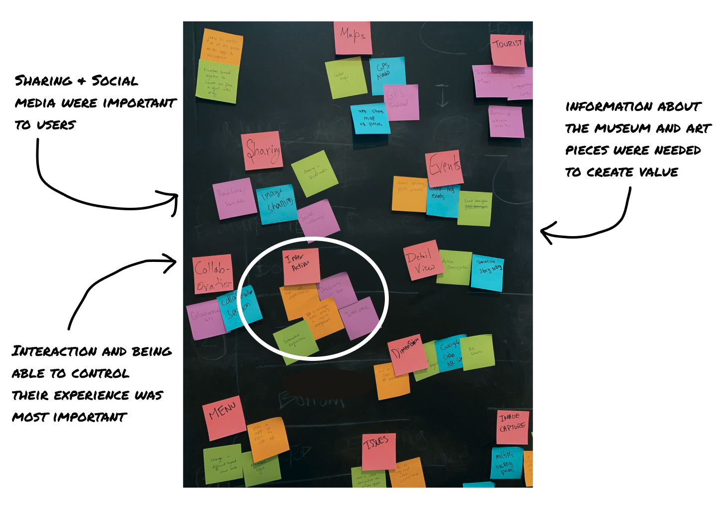
Armed with a defined problem; how can we get users to return, and a hypothetical solution; create a digital experience that is engaging, social, and informative, we began our user research. We conducted ample competitive research to see what was already working and what was missing or could be improved upon. We also took comparative inspiration from more social apps like Instagram, Snapchat, and even PokemonGo. We used this research to formulate a 15 question survey and collected over 60 responses regarding our target users’ current museum habits. We turned these survey responses into an affinity map to visualize exactly what was the most important to our potential users.
Using the information gathered from our survey we conducted 8 in-depth user interviews to define what exactly people were looking for in their museum-going experience, capture what has made their visits great in the past and what has been lacking or detracting from their experience. Our questions focused on past experiences rather than open-ended hypotheticals as we wanted to hear more about what has actually been successful rather than having people guess at what could possibly happen.
Observing out in the wild
We also spent time in the museum observing museum-goers behavior. We observed two levels of engagement in museum-goers.
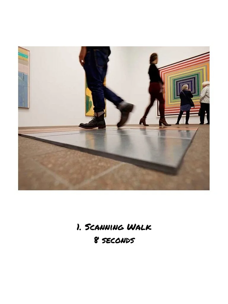
1. The scanning walk: People tend to spend about 8 seconds looking at a piece of art as they walk through a room.
“I enjoy the art but I get bored with it, can't stare at art for too long.” -Blake
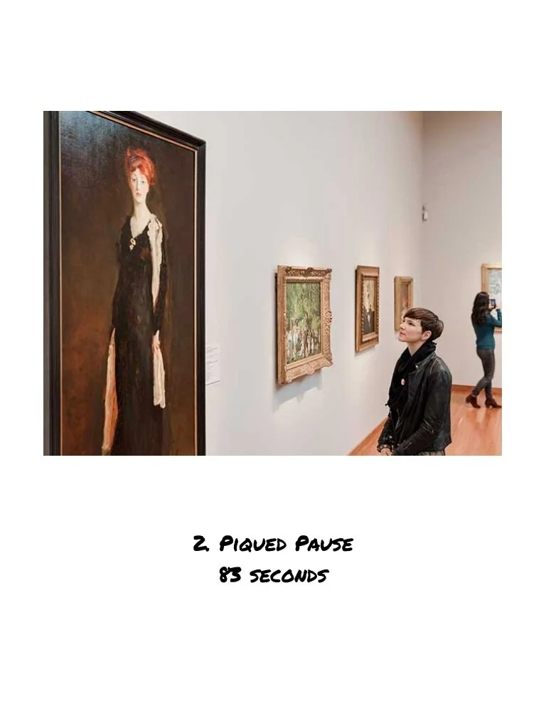
2. Piqued Pause: When the text was readily available to a viewer the average viewing time increased to 83 seconds per piece.
“Pace of museum is different for me. I look at everything at 1st but if something is appealing it drives my attention.” -Liza
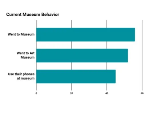
Out of 63 participants
89% visited a museum at least once in the past year.
84% specifically visited an art museum.
71% use their phones to take pictures at museums
What
We
Learned
Design Process
featuritis
We started our design process with a brainstorm of all the possible features we thought would be beneficial for our users. We then affinity mapped all of these features into four main categories; map, personalization, calendar, and AR.
From there we mapped out all the various features based on how much effort and impact they would take. We knew then that we would focus exclusively on features that landed in the high impact and low effort quadrant given the scope of the project.
Through mapping our features we also realized that taking on a calendar feature was outside of the scope of this project and was not as impactful toward our goal of increasing viewer engagement.
A picture is worth 1,000 words
We knew we needed to create a home page and menu bar to help guide users in the app. We also needed a map to help guide users in the museum. We were also set on creating some sort of personalized interactive experience
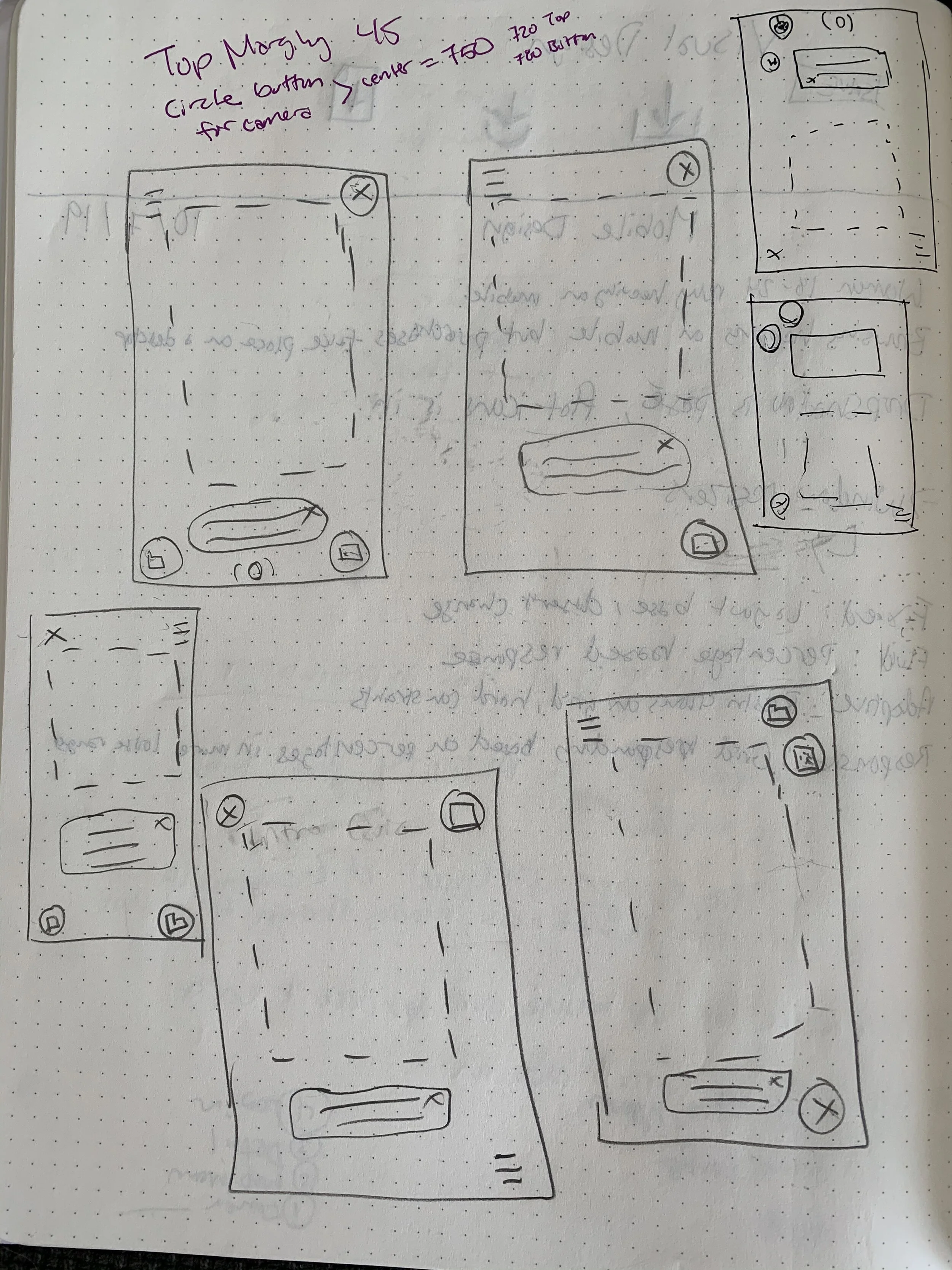
Using our competitive and inspiration research along with all of our user data we set about creating visual solutions. We individually created 8 quick frames highlighting the major aspects and features we felt were important to our app. We then came back together as a team and talked through what we had created and what we liked in each other’s sketches.
After a few rounds, we had some strong ideas emerging and we were aligned and excited about what we were creating. Starting with our four unique frames and then building and borrowing from each other allowed for an organic consensus.
Simple, Social, Playful
When discussing how to make our app desirable to new users I knew I wanted to capitalize on two things, making it social and making it playful. In our user interviews, there was a theme of feeling as though museums can be stuffy or overwhelming and I wanted to directly combat by creating a game.
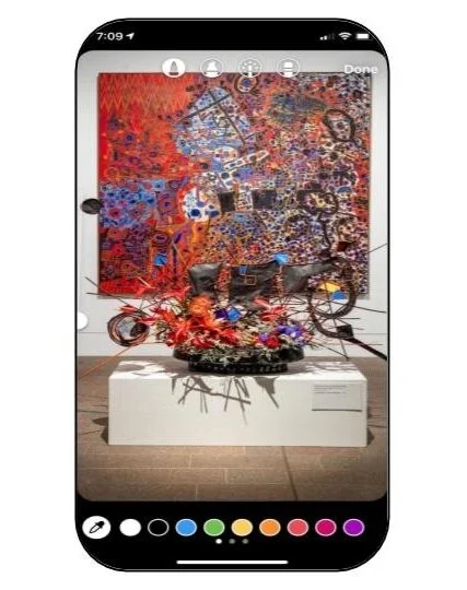
Since Bouquet to Arts is all about creating floral arrangements inspired by the art it made sense to me to draw on that idea for a game. I wanted to create a game where everyone could participate in the exhibit and build their own bouquets on their phone. The idea was simple enough, snap a picture of a piece of art and then use our app to select and place flowers in a bouquet inspired by the art piece.
This naturally led to the social aspect of sharing creations on the social site of their choosing. In having users share their bouquets on social media the museum gains free marketing and others will want to download the app to create their own bouquet.
Beauty and Brains
With the barer to entry lowered with the allure of a beautiful personalized bouquet to share on social media, we turned our attention to the more practical aspect of our app, the actual museum information.
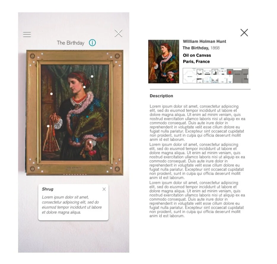
We knew we wanted to incorporate some aspect of discovery or play into what could be seen as just boring text so we decided on embedded in the pieces of art with animated dots that users could tap on to reveal information about the art. This encourages users to spend more time looking at the piece of art while also discovering new facts.
To keep traditionalists satisfied we also crafted a more familiar details view where information is presented in the standard block text.
Final Product
We ended up with an informative, playful, and engaging app that draws on familiar conventions to encourage users to explore and discover more about the museum and art. Below is a video showing a walk-through of our app.
Next Steps
It was clear from the number of initial features our team wanted to include, that this project could continue for many months if given the time and resources. Some key priorities I think that would enhance the user engagement and success of the app would be creating personalized museum tours based on the user unique preferences and including a calendar section featuring upcoming events and new exhibits to entice users to return.